

What happens when an organisation spends millions on IoT infrastructure, watches a dashboard light up with real-time data, and then continues to run operations the same way it always has?
That question sits at the centre of one of the most expensive misunderstandings in industrial technology today. It is not a question about technology failure. The sensors are working. The connectivity is stable. The platform is live. Everything appears to be functioning exactly as promised. And yet, the decisions being made in the boardroom still lean on intuition, historical reports, and the professional instincts of people who have been doing this long enough to trust their gut over any screen.
This is the Dashboard Illusion. And it is far more common than the industry cares to admit.
The Moment the Dashboard Went Live
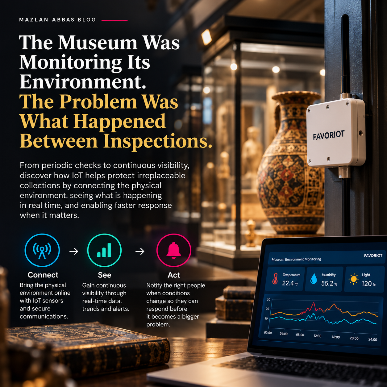
There is a specific moment in every IoT deployment that feels like a turning point. The system integrator completes the installation, the platform goes live, and for the first time, leadership can see facility data in real time. Temperature readings from the factory floor. Energy consumption across building zones. Machine uptime metrics refreshing every few seconds. It feels like clarity.
The budget approval that started this journey was never really about the technology. It was about solving a specific operational problem: reducing unplanned downtime, cutting energy waste, understanding asset utilisation at a level of detail that gut feel could never provide. The dashboard was supposed to be the answer to those problems.
What often happens next is where the story gets complicated.
Visibility Is Not the Same as Understanding
Operational blindness does not always look like darkness. In its most dangerous form, it looks like a screen full of numbers that nobody has been trained to interpret, connected to a decision-making culture that was never redesigned to use them.
Research on human cognition and information processing has consistently shown that presenting people with more data does not automatically improve their decisions. In fact, the opposite can occur. When decision-makers are confronted with dashboards containing dozens of metrics without clear contextual framing, they tend to anchor on the figures they already understand and quietly discount the rest. The dashboard becomes wallpaper. It is present, but it is not doing the work it was built to do.
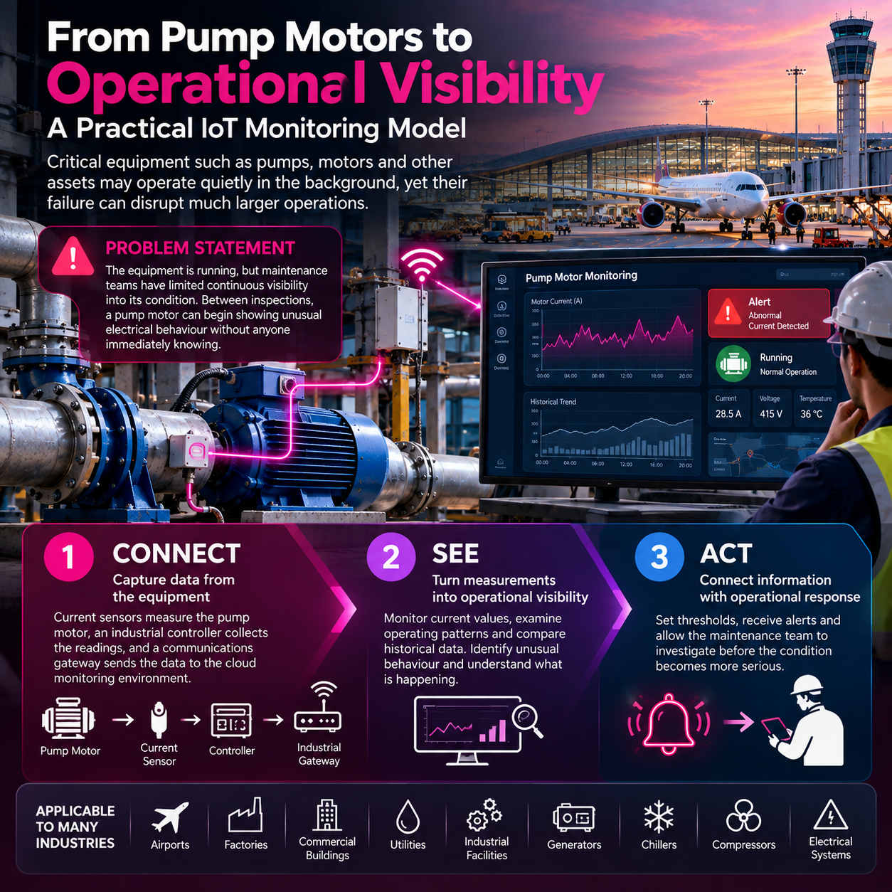
In manufacturing environments, this pattern plays out across production floors where energy and vibration sensors are installed on critical equipment but the maintenance team still schedules servicing based on fixed calendar intervals rather than condition-based signals. The data exists. The decision process has not changed. The gap between the two is where operational risk lives.
In smart buildings, the same dynamic appears in a different costume. Building management teams can now see occupancy rates, HVAC performance, and lighting load by zone. But if the facilities manager is still receiving a weekly summary report prepared by a junior analyst who manually reads the dashboard and writes a paragraph, the loop from data to decision has not shortened at all. It has simply added a step.
The ROI Pressure Trap
There is a psychological dimension to the Dashboard Illusion that makes it particularly resistant to diagnosis. Organisations that have made a significant IoT investment carry an incentive to believe the investment is working. Naming the problem after the technology has been deployed carries a cost that most leadership teams are not prepared to pay publicly.
This is not dishonesty. It is a well-documented cognitive pattern known as the sunk cost effect, combined with the social dynamics of institutional accountability. The executive who championed the IoT budget does not want to stand in the next quarterly review and explain that the data is flowing but the decisions have not changed. The vendor who delivered the platform does not want to be drawn into a conversation about change management, which was never in their scope of work. The system integrator who installed the hardware wants to move to the next project.
The result is a conspiracy of silence around a problem that is hiding in plain sight. The dashboard continues to refresh. The meetings continue to run on instinct. The gap continues to grow.
And the organisation continues to believe it has solved its operational visibility problem because the technology is running.
What Clarity Actually Looks Like
Visibility means the data exists and can be seen. Clarity means the data is structured, contextualised, and connected to a decision pathway that produces a different outcome than would have occurred without it.
The distinction matters enormously in practice.
In a manufacturing context, clarity looks like a condition-based maintenance alert that triggers a specific workflow, assigns it to a named technician, and records the outcome against the asset’s service history. It is not a graph that shows vibration frequency trending upward. It is a system that knows what that trend means, who needs to act on it, and by when. The data has been translated into a decision that would not otherwise have been made.
In a smart building context, clarity looks like an HVAC optimisation model that adjusts zone temperature based on occupancy prediction, validated against actual energy consumption, and reviewed weekly by a facilities team that understands what the model is doing and why. It is not a dashboard showing that Meeting Room 4 has been cooling an empty space since 9am. It is a system that has already acted on that information before anyone had to look at a screen.
The difference between visibility and clarity is not a software feature. It is an organisational capability. It requires that someone in the organisation is accountable for the gap between the data and the decision, that the decision-making process has been redesigned around the data, and that there is a mechanism for measuring whether the data is actually changing outcomes.
The Philosophical Problem Worth Naming
Organisations should not have to guess about conditions they are already measuring. That is the philosophical case for operational IoT. But the technology alone does not make that case true. The technology creates the possibility. The organisation has to choose to make it real.
The Dashboard Illusion persists because it is easier to point to the screen than to redesign the workflow. It is easier to say “we have a smart building” than to audit whether the building is actually being managed more intelligently. It is easier to report that the IoT system is live than to measure whether it is producing decisions that would not have happened otherwise.
This is not a technology problem. It is a clarity problem. And the most important step is being willing to ask, honestly, whether the dashboard is informing decisions or merely decorating the room where decisions are made.
What does the IoT data in your organisation actually change? Not what it shows. What it changes.
This article is part of IoT World’s ongoing series on Operational Intelligence and the gap between data collection and data-driven decision-making. Connect with the IoT World community at iotworld.co. It is written by Dr. Mazlan Abbas, CEO of Favoriot who has defined Operational Blindness in the AIoT Context.



Leave a Reply